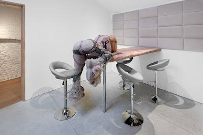
Saatchi Gallery: Paper (until 3rd November 2013)
As ashamed as I am to admit it, yesterday was my very first visit to the Saatchi Gallery, SW3, where you can find the latest in contemporary art, free of charge to visitors. One of its current exhibitions, Paper, has a vast collection, as you might expect from such a broadly titled collection. However there is nothing predictable nor simple about the Paper exhibit.
One of the most technically astounding artists on show is Eric Manigaud, with his collection of terrifyingly accurate works, which initially appear to be grainy photographs from the early twentieth century but are in fact pencil and graphite drawings. I use the word 'terrifyingly' as a double-entendre as his portraits depict moments of disturbing horror, yet cleverly Manigaud has maintained his viewers' attention by omitting any graphic detail, instead opting for the subtly sinister greyscale tones of the graphite to convey the misery and solitude of his subjects. The artist has the focal subject of each piece communicating with the viewer through eye contact, with adds an additional eerie tone to his work, as pictured below.

One of the most technically astounding artists on show is Eric Manigaud, with his collection of terrifyingly accurate works, which initially appear to be grainy photographs from the early twentieth century but are in fact pencil and graphite drawings. I use the word 'terrifyingly' as a double-entendre as his portraits depict moments of disturbing horror, yet cleverly Manigaud has maintained his viewers' attention by omitting any graphic detail, instead opting for the subtly sinister greyscale tones of the graphite to convey the misery and solitude of his subjects. The artist has the focal subject of each piece communicating with the viewer through eye contact, with adds an additional eerie tone to his work, as pictured below.

But of course, in a collection of contemporary art, amongst photorealistic drawings, you are bound to find some more surreal compositions, and my choice for this category is the work of Sean Dack. The New Yorker exploits the 'murky territory of photographic unfaithfulness' to show his audience a combination between realistic landscape photography and the latest in printing technology to showcase a unique, colour-defying style. His piece, 'CCTV #2', supplies Dack's audience with the relatable image of what appears to be a skyscraper building surrounded by traffic, married with blocked, staggered shapes to give the photograph an expressively colourful feel without losing the sense of reality. Another of Dack's pieces, 'Los Angeles Helicopter', displays a vibrant yet dysfunctional beauty within the image, showing how mixing and adding a different palette to an image can give it another dimension, as well as accentuating the details of his photography.
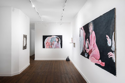
There are so many more artists whose work I'd love to write about but seeing as I need to narrow it down, I feel that I have to talk about Dawn Clements. Chronologically from entering the room, the first image we see is 'Untitled (Colour Kitchen)', which is a series of small, coloured sketches on a large piece of paper. There is a very sweet, comfortable feeling to the piece, with her use of flowers and primary colours in a large way. However we then move on to 'Travels With Myra Hudson', in which the artist has used black gouache to create a huge spectacle, over fourteen metres in width. Her choice of material, which can be made opaque when necessary, makes the image both haunting and endearing in equal measure. We cannot help but feel that Clements is taking us back to a moment in time with the use of a house. Her delicately and meticulously drawn image is an undoubtedly intimate setting, which rings true for both 'Untitled (Colour Kitchen)' and 'Travels With Myra Hudson'. The use of a name in the latter reinforces this.
There is so much variety at the Paper exhibition that you are sure to find something that either challenges your ideas, opens your eyes or amuses you. I wholeheartedly recommend this exhibition, as, accompanied by the New Order: British Art Today exhibition, the Saatchi Gallery remains one of London's hottest locations for contemporary art.